THE ANNOUNCEMENT FILM · GLOBAL FINTECH FEST 2025 · MUMBAI
Pay for what you see. But
the interaction was the easy part.
To reach our goal of selling 10M devices, we wanted to integrate payments to enhance value proposition of Ray-Ban Meta glasses.
Live demoed at the Global Fintech Fest in Mumbai in Oct 2025, earning Wearables leads buy-in and a place on the Wearables H1 ’26 roadmap.
A new reason to buy, built on
a behavior that already existed.
Everyday utility sells
Payments add a high-frequency use case—giving people a stronger reason to buy and wear the glasses every day.
Closer to North Star
Payments moves AI glasses beyond capture and communication—one step closer to becoming a general computing device.
 BEFOREAFTER
No PRD, just one toggle.
A Tech Lead came to me, asking for a switch in settings:
“turn on UPI Lite, and payments work,” he said.
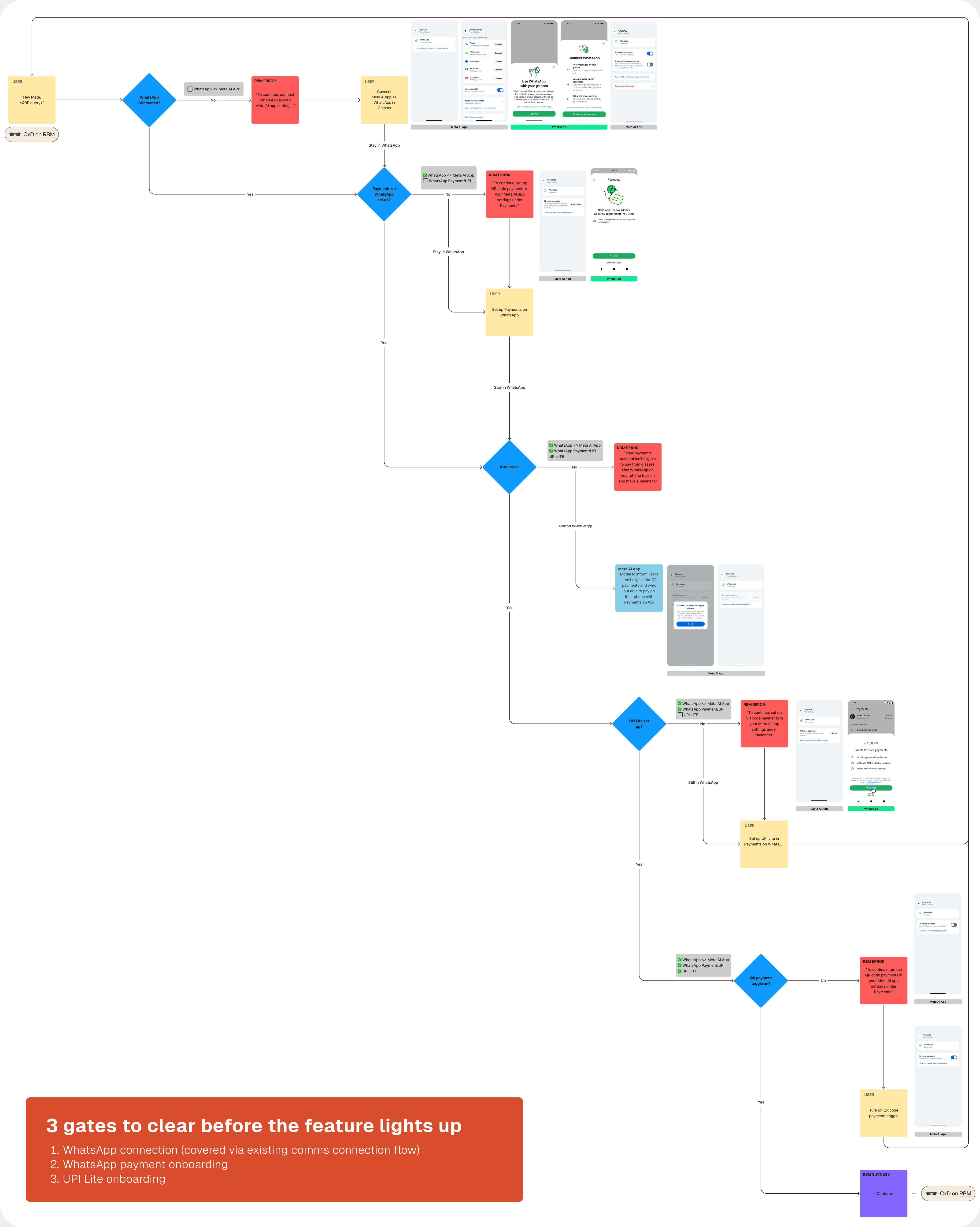
Two devices, three gates,
one path nobody had drawn.
How do I make three onboardings feel like one, when finishing them doesn't mean you can pay?
If a wearer can't get from one onboarding to the next, and can't understand why they can't use the feature — the experience is broken.
Technical
Only one PSP out of four is eligible
UPI Lite on WhatsApp was newly launched last year, it only worked with 1 PSP out of 4 in total == Eligibility is decided at the PSP-binding step during the setup of Payments account. Regulation distributes accounts evenly across all 4 — capping the pilot at roughly 25% of wearers who started setup.
Some wearers arrive already bound
We could force the eligible PSP at the binding step — but only for wearers who weren't already spoken for. If their own bank runs a PSP, it takes the binding. And if they'd set up Payments on WhatsApp before, a reinstall carries the original one through.
Consumer
Invisible eligibility
Nothing tells wearers whether payments can work for them until they are deep in setup, and there's no fix if ineligible.
Dead-end setup
Finishing one onboarding doesn't hand wearers to the next. WhatsApp doesn't automatically redirect them to set up UPI Lite after they set up a Payments account.
Set up here, learn there
Feature education and settings setup are separate flows. Wearers set up in one place, then have to go find how to use it in another.
Aligned the whole flow across 5 teams’ surfaces through 10+ reviews
Pilot experience over scalability.
We do the heavy lifting; wearers just tap a button.
Don't disturb the existing communications flow.
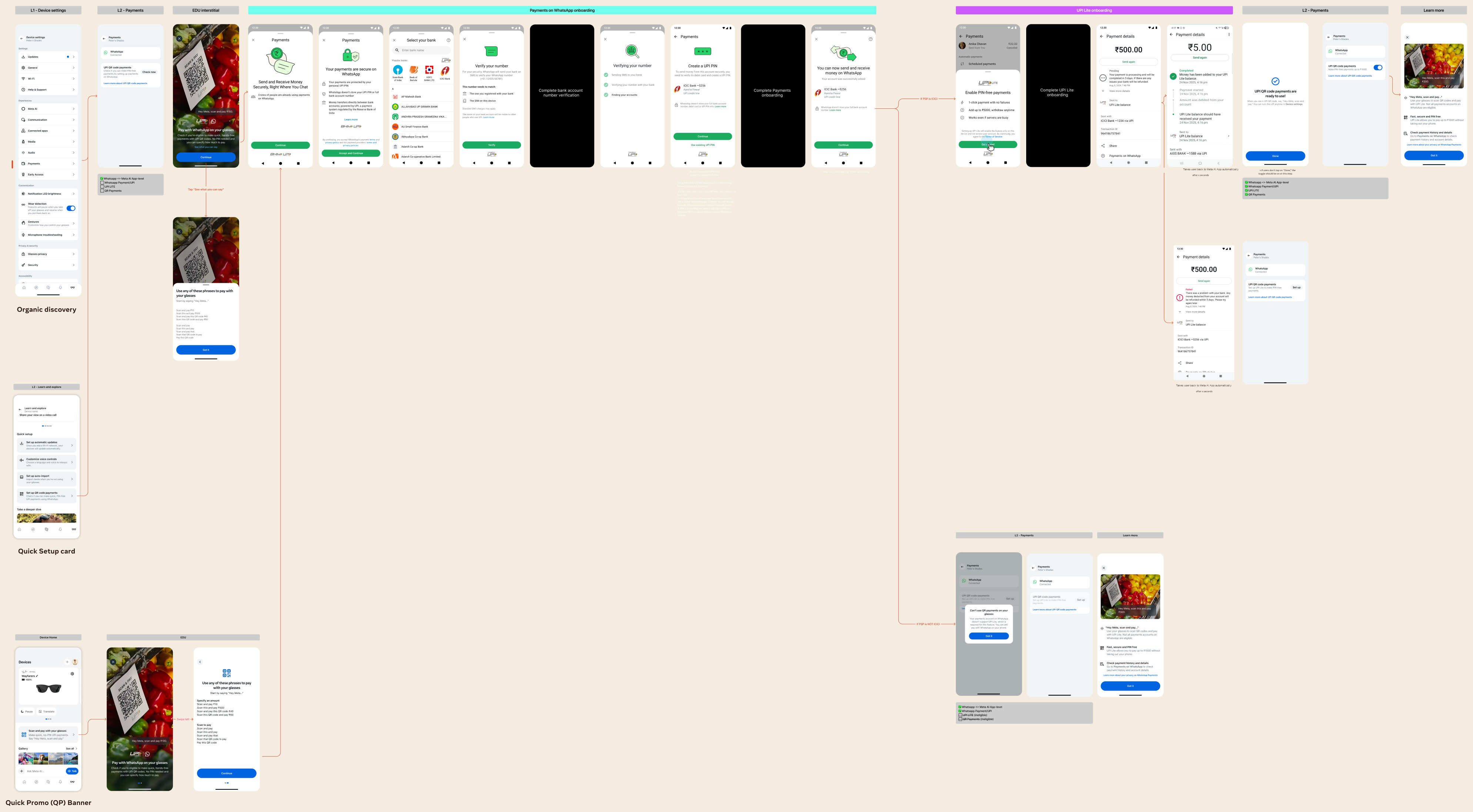
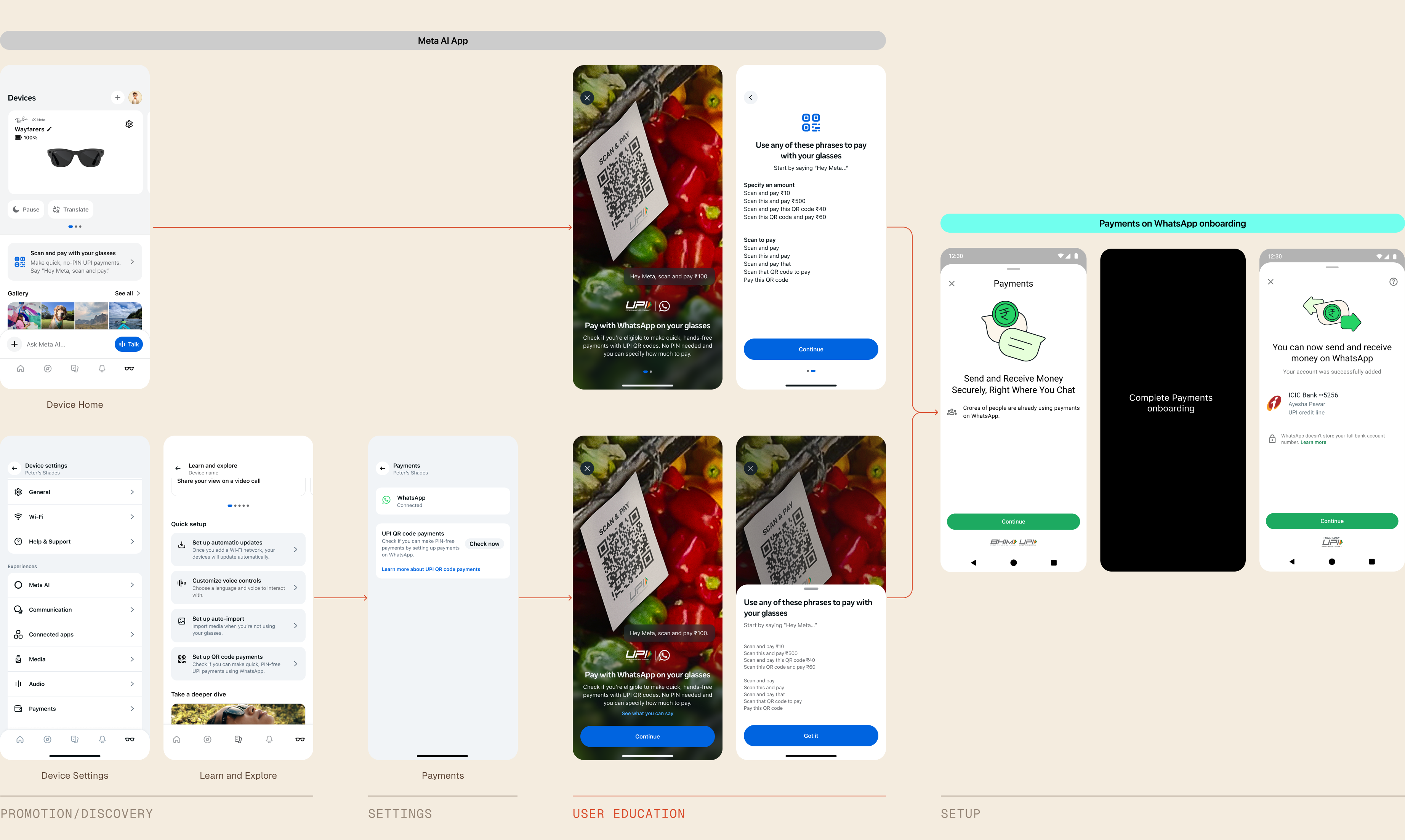
3 gates, 17 screens in total
All 3 gates take wearers to WhatsApp, with at least 17 screens involved if a wearer has never set anything up. I need to design for a drop-off at any point.
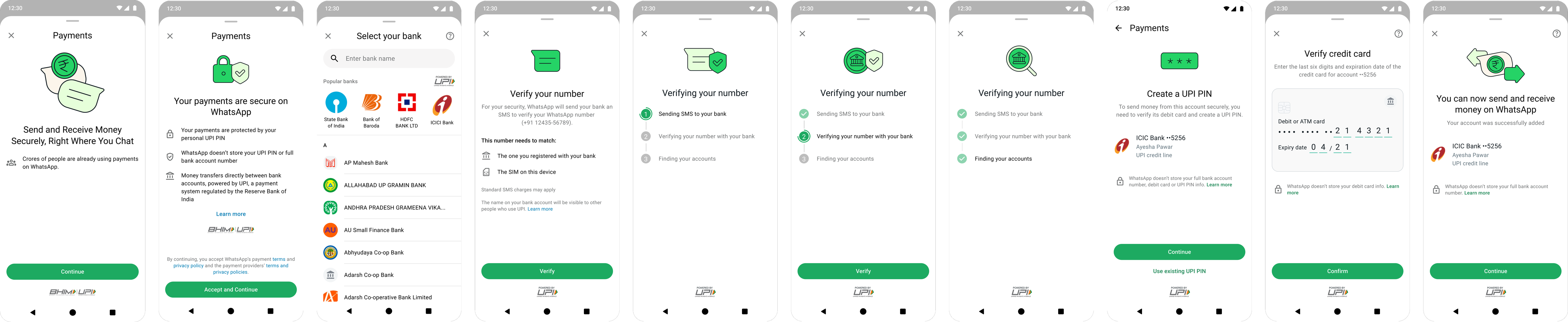
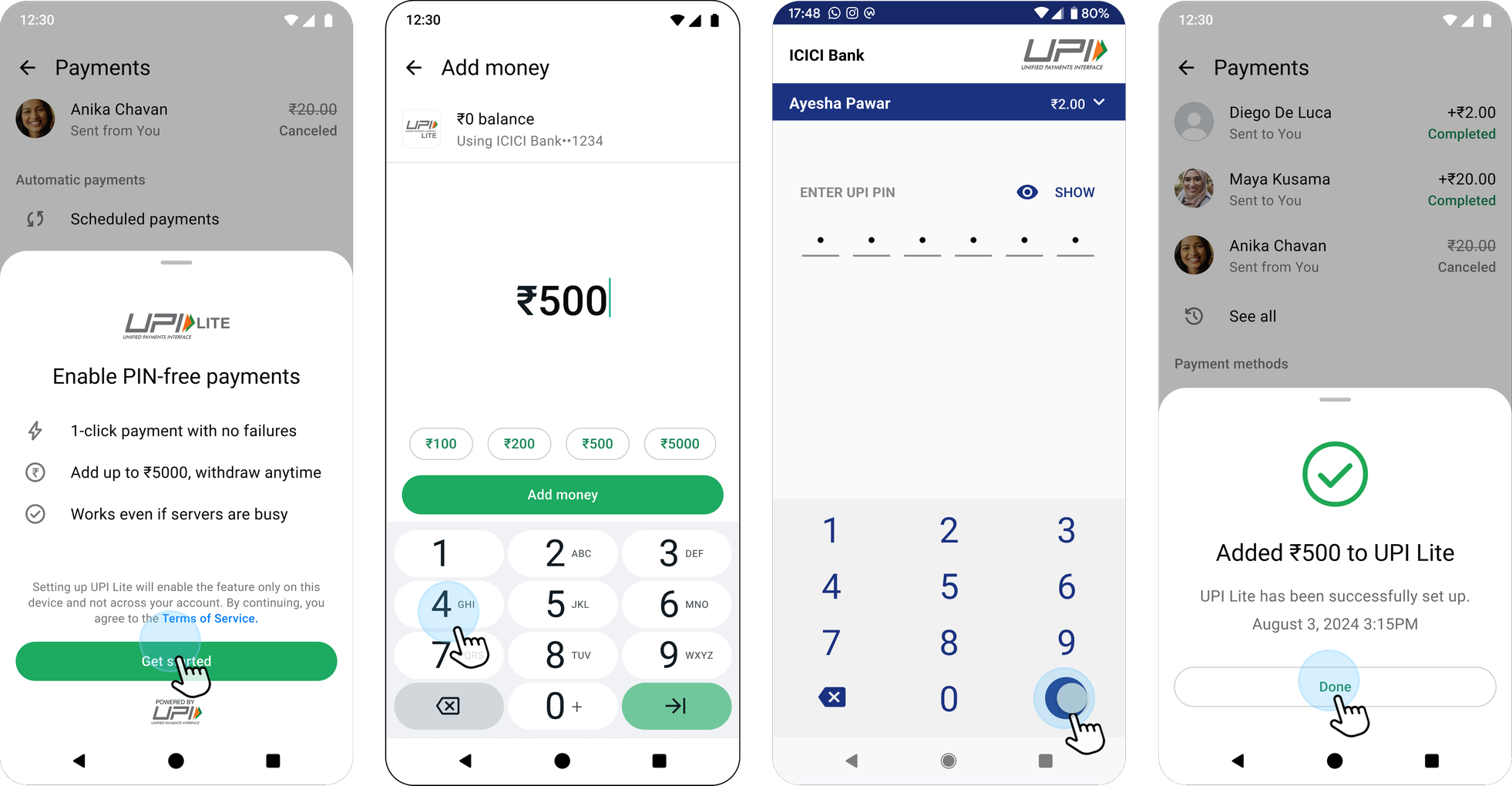
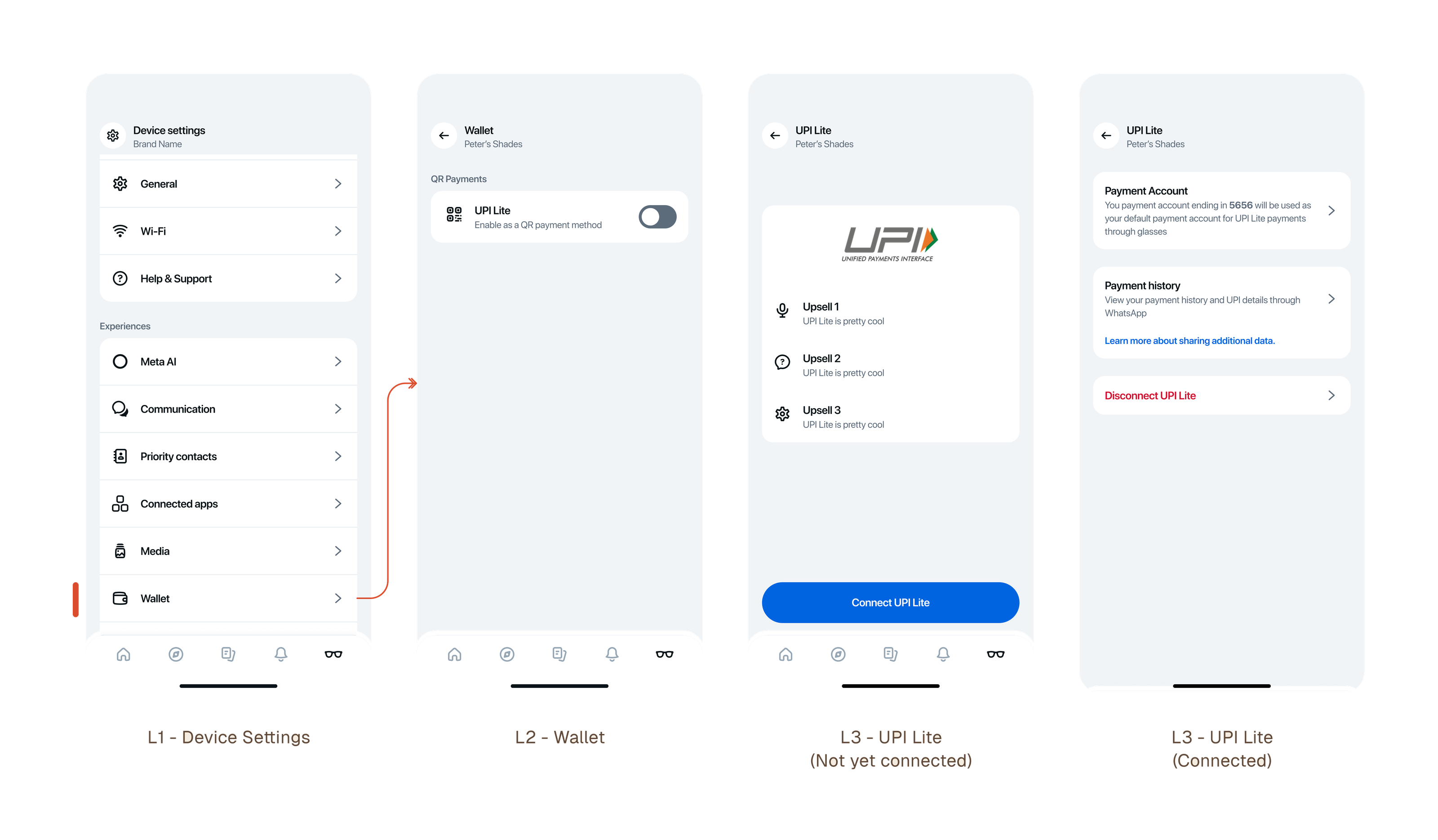
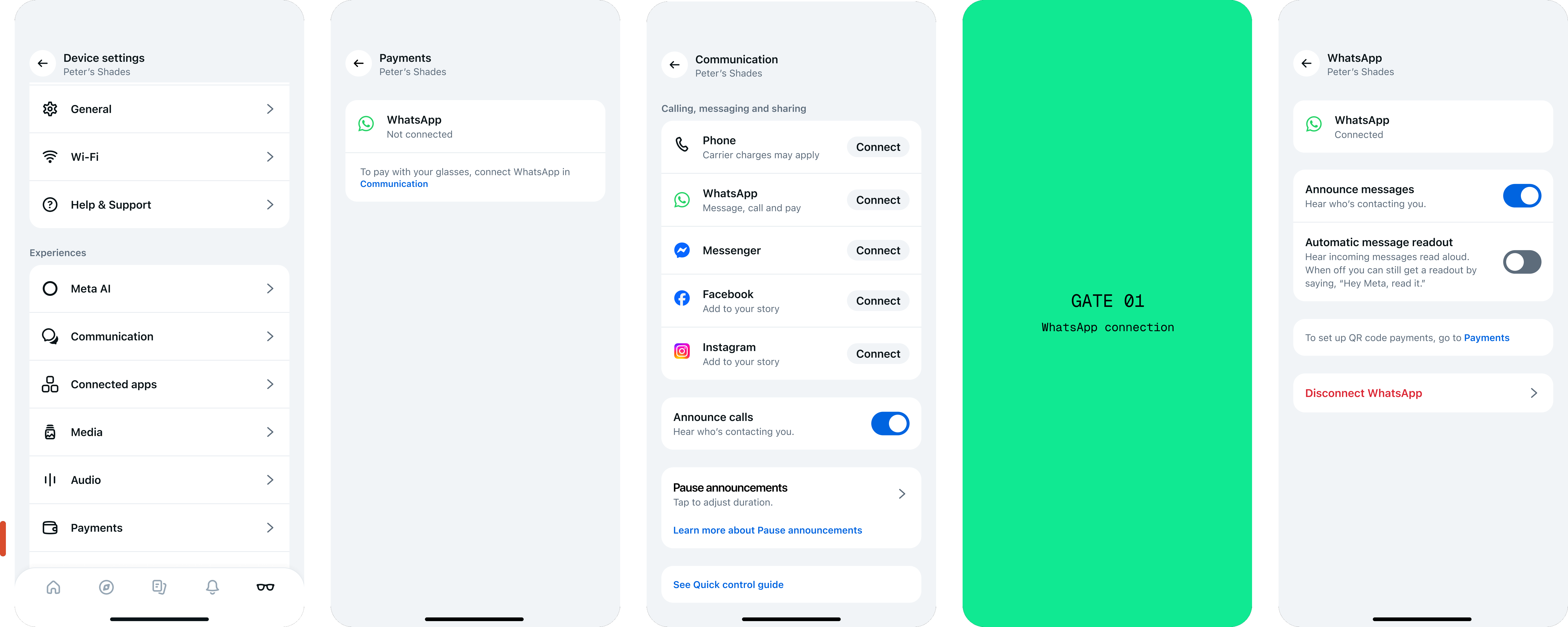
Settled on one nested entry point — for now.
After numerous alignment rounds with Meta AI app, Settings, Communications and WhatsApp teams, and given how the backend was wired, we settled on this for the short term. The Settings team was overhauling connected app into one place, which would fix it for good.
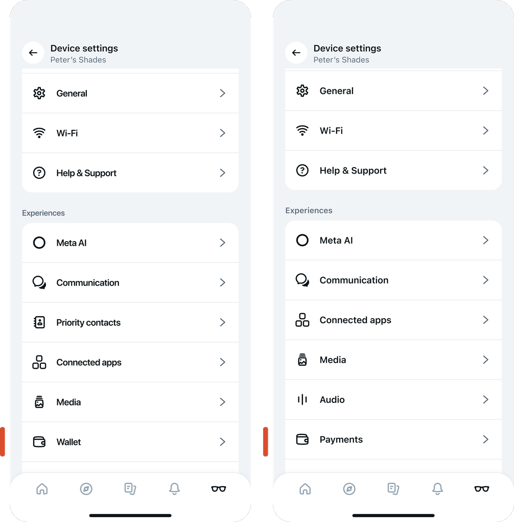
We debated what to call the tab. Payments won over Wallet because of the mental model already attached to “Wallet” — a place that holds cards. “Payments” is a place where different payment services and apps can co-exist.
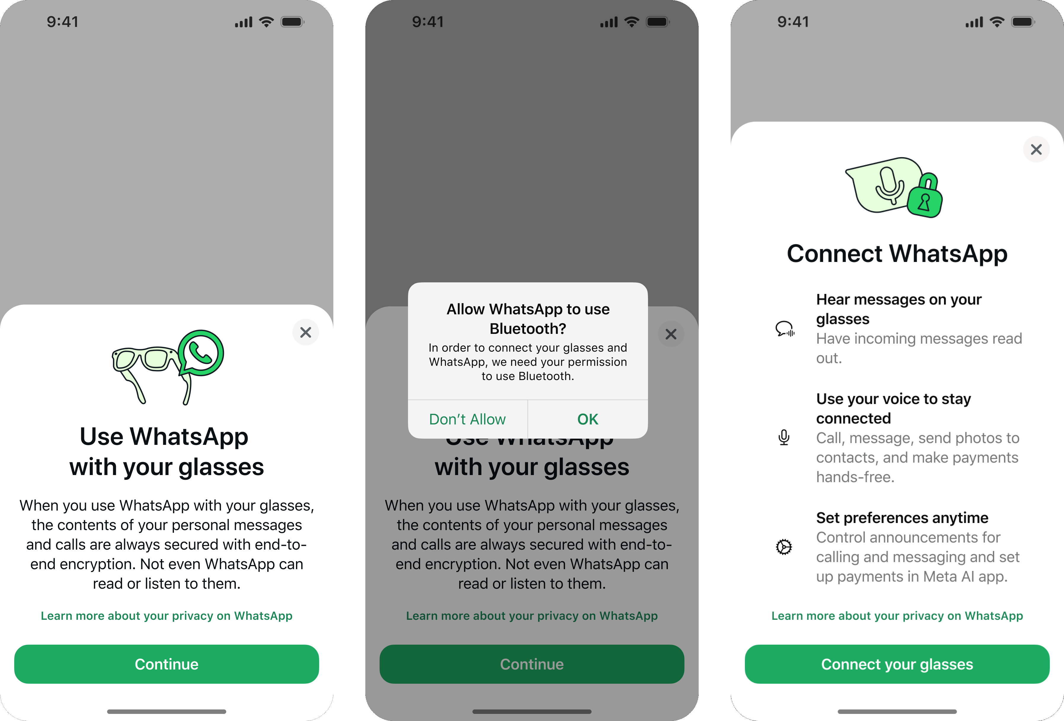
At first I designed the flow to connect UPI Lite. But that is the wrong mental model: what is actually being connected with the Meta AI app is WhatsApp. Wearers reach UPI Lite through WhatsApp — they can’t connect to it directly. UPI Lite is a wallet bound to a bank account which can only tie to one payment app.
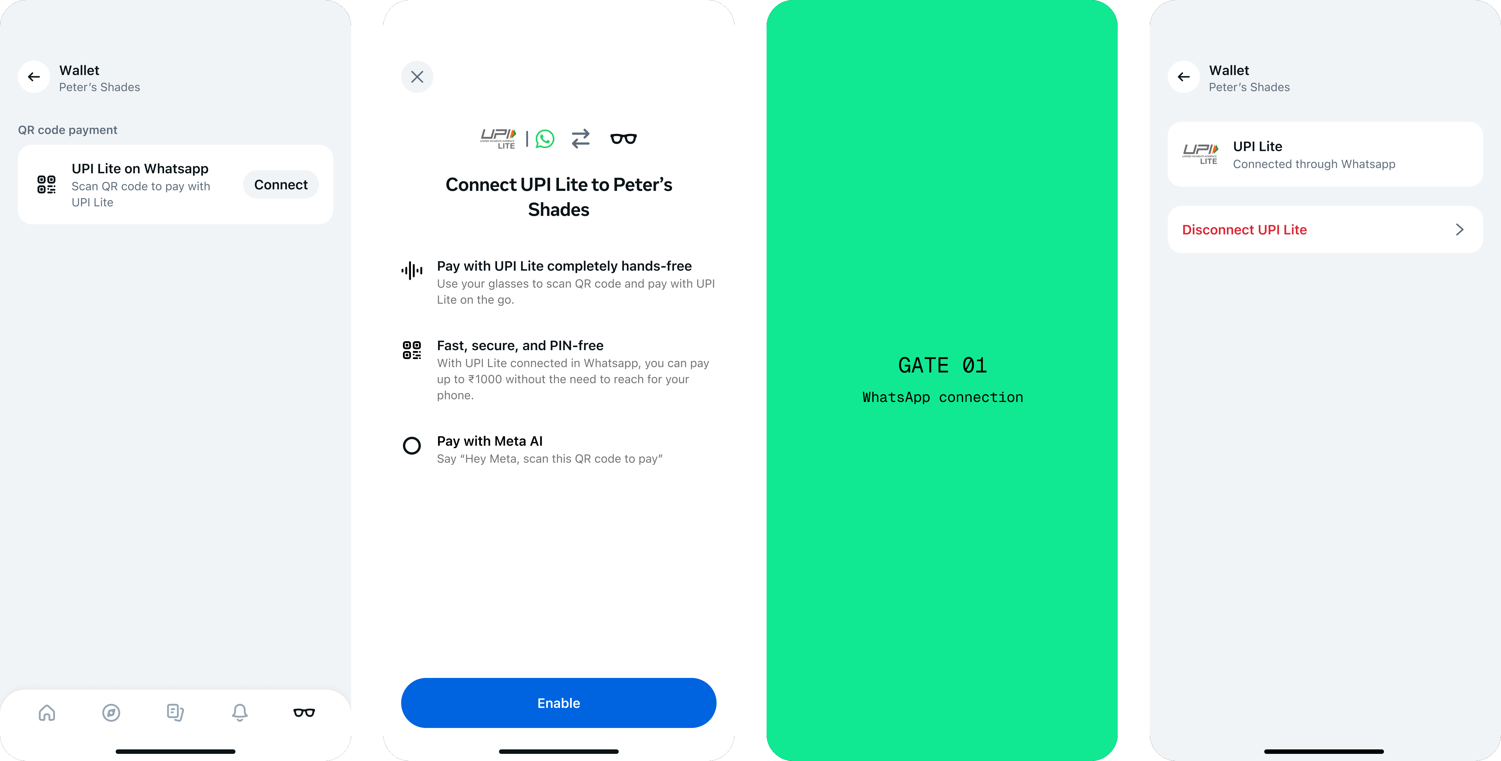
First gate is WhatsApp — a communication app that does payments as well. Indian wearers don’t necessarily associate UPI Lite with WhatsApp, so payments needed a dedicated entry point, yet a connection flow already lived in the Communication tab.
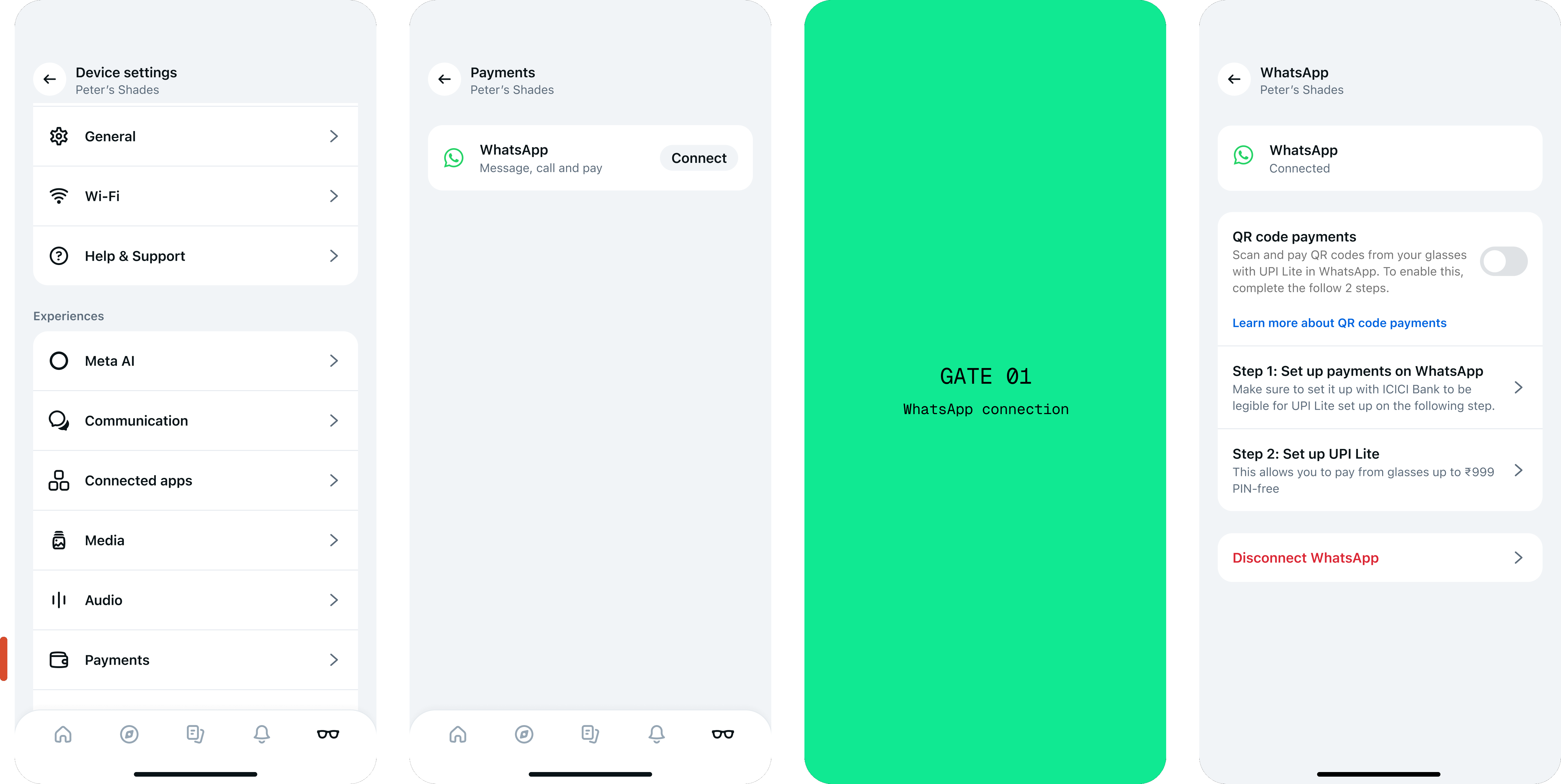
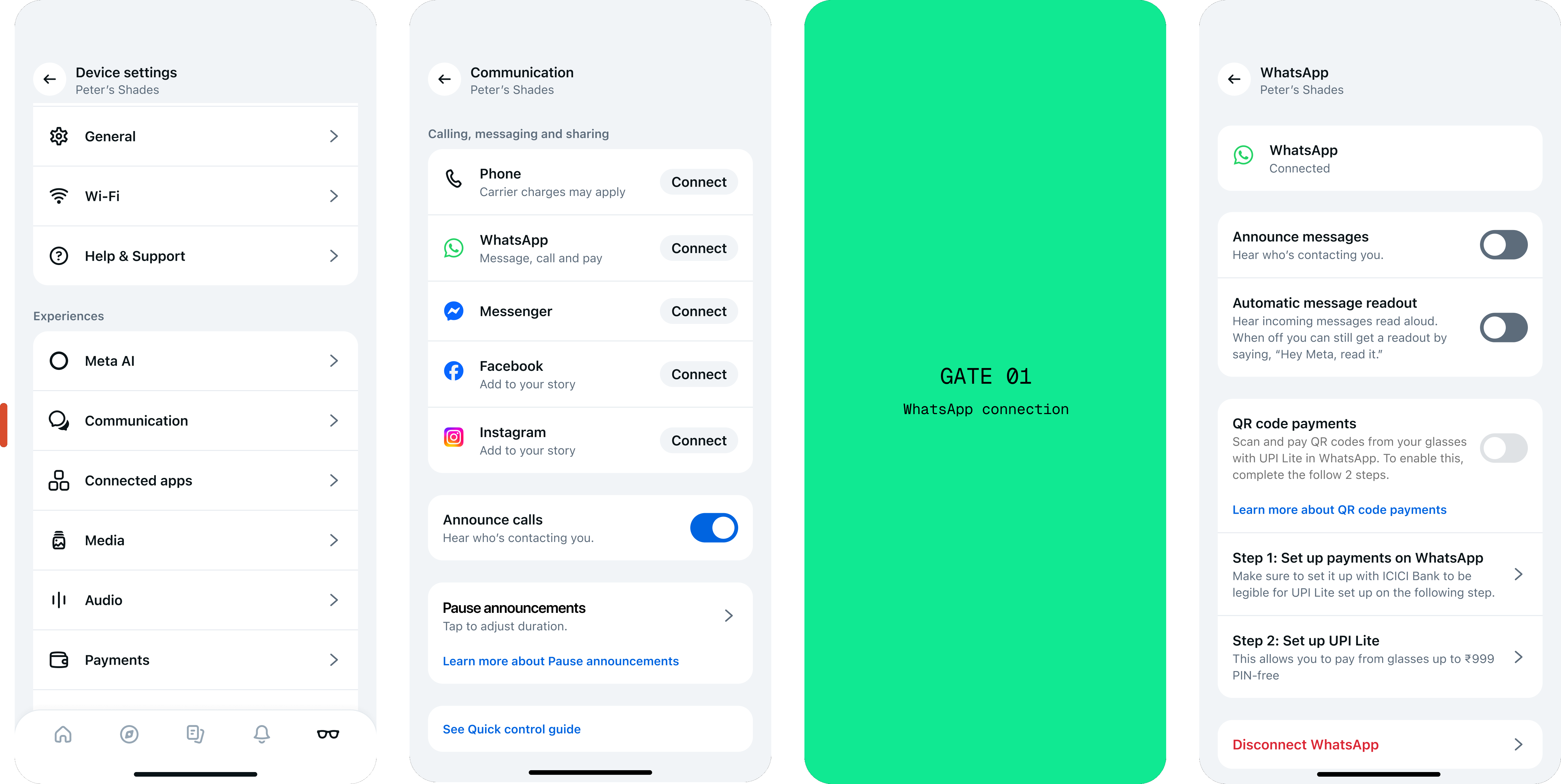
- Scalability
- Full ownership of the surface
- Discoverability
- Duplicates the WhatsApp connection already in Communication
- Two places to connect WhatsApp reads as confusing
Accommodates where each wearer is at the launch of the feature
6 scenarios at launch. I simplify and clarify the setup progress and communicate eligibility constraints.
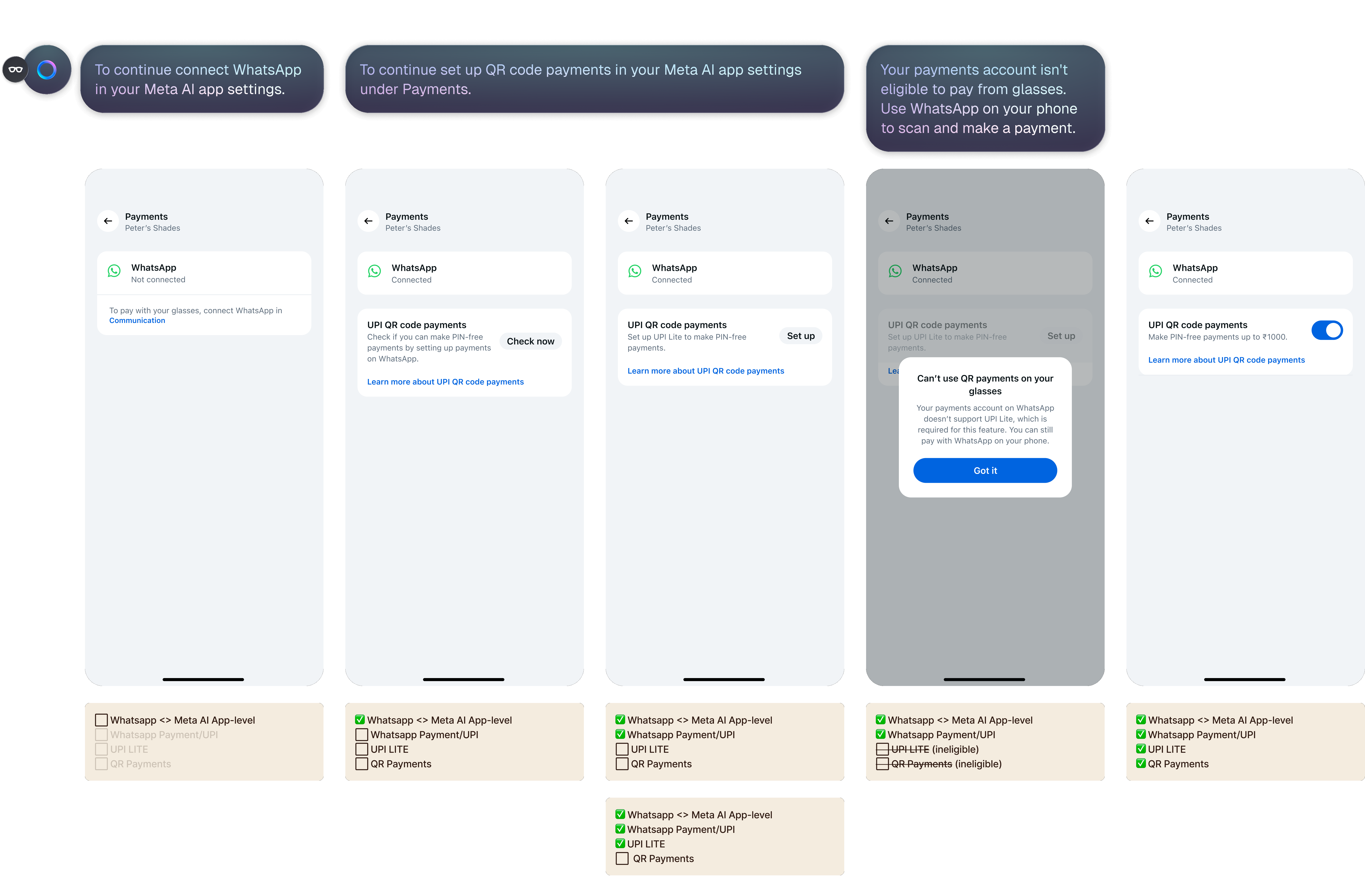
We do the heavy lifting so wearers don’t need to think or understand the complexity
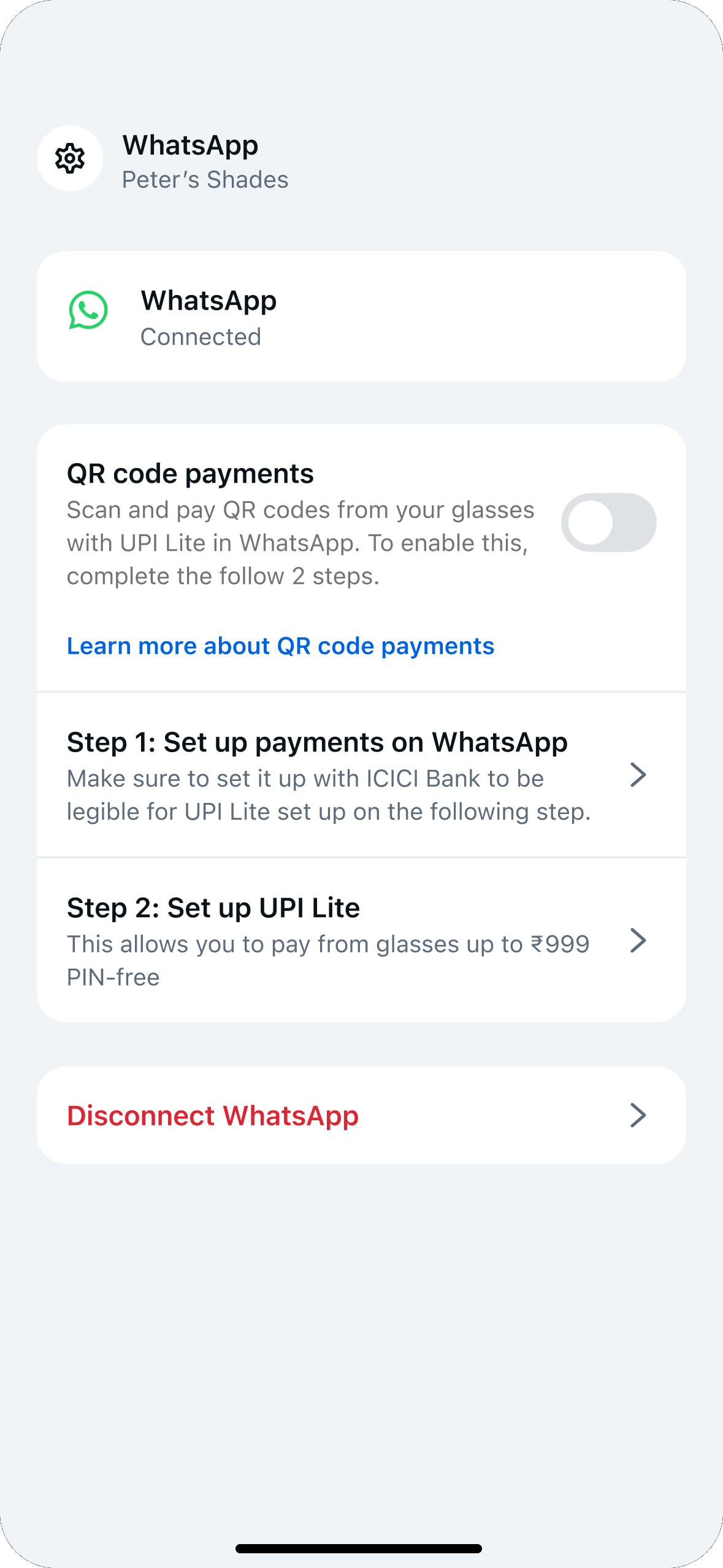
No indicator of progress
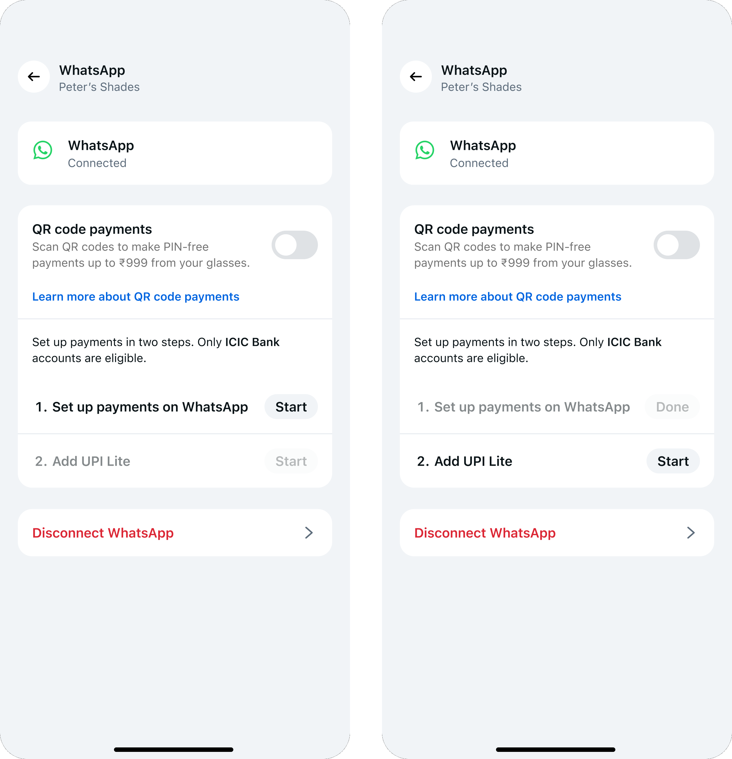
Clear where they are in the setup progress but creates cognitive load to understand
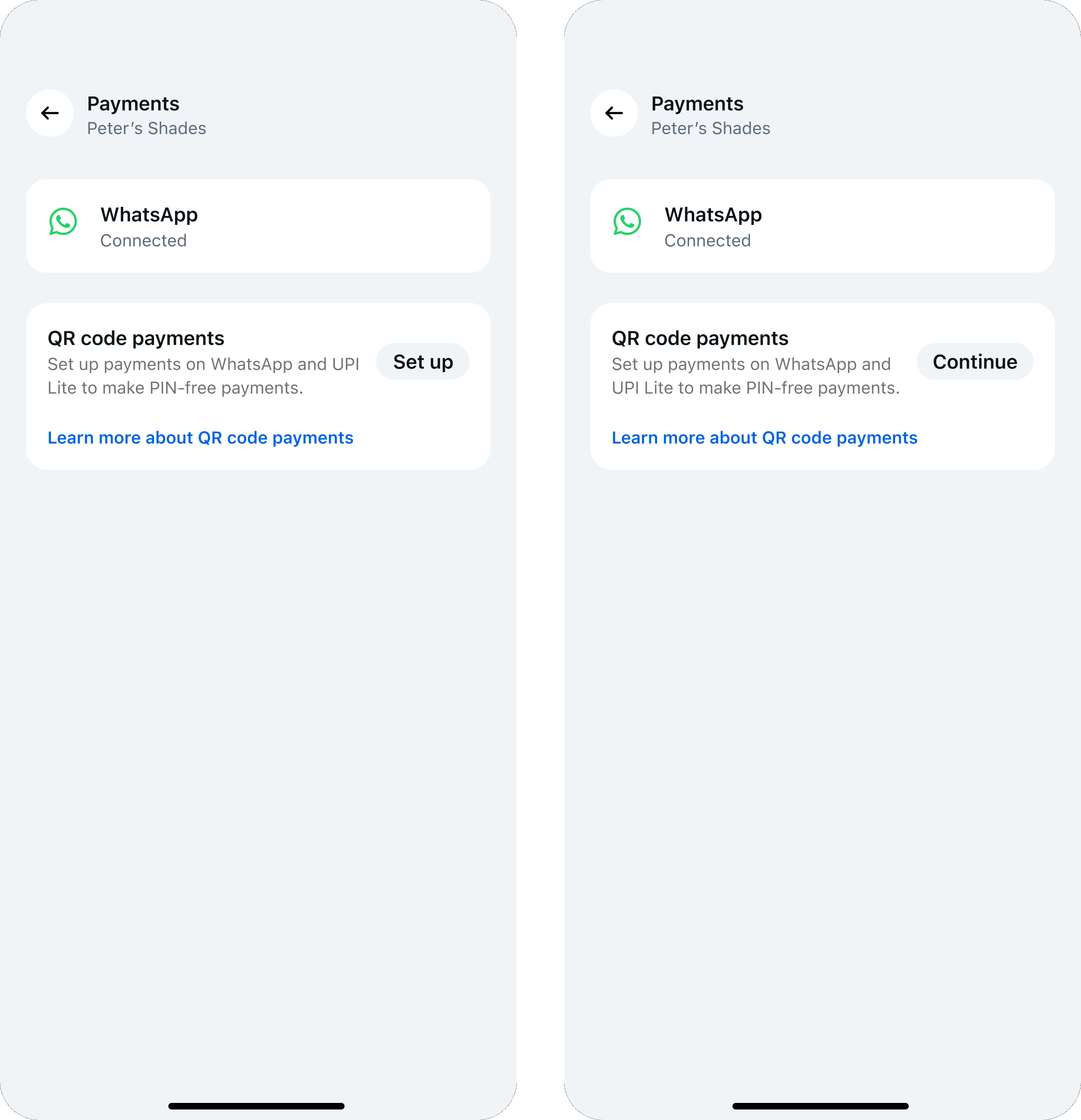
Simplified but wearers wouldn’t know that there’s a chance they won’t be eligible
This is GOLD! — PM
THE MODULAR PROTOTYPE — TOGGLE AND PICK A USER SCENARIO, SEE HOW FAR THROUGH THE GATES THEY ARE.
The modular prototype is what made the complexity legible in the room across 10+ leadership and build reviews.
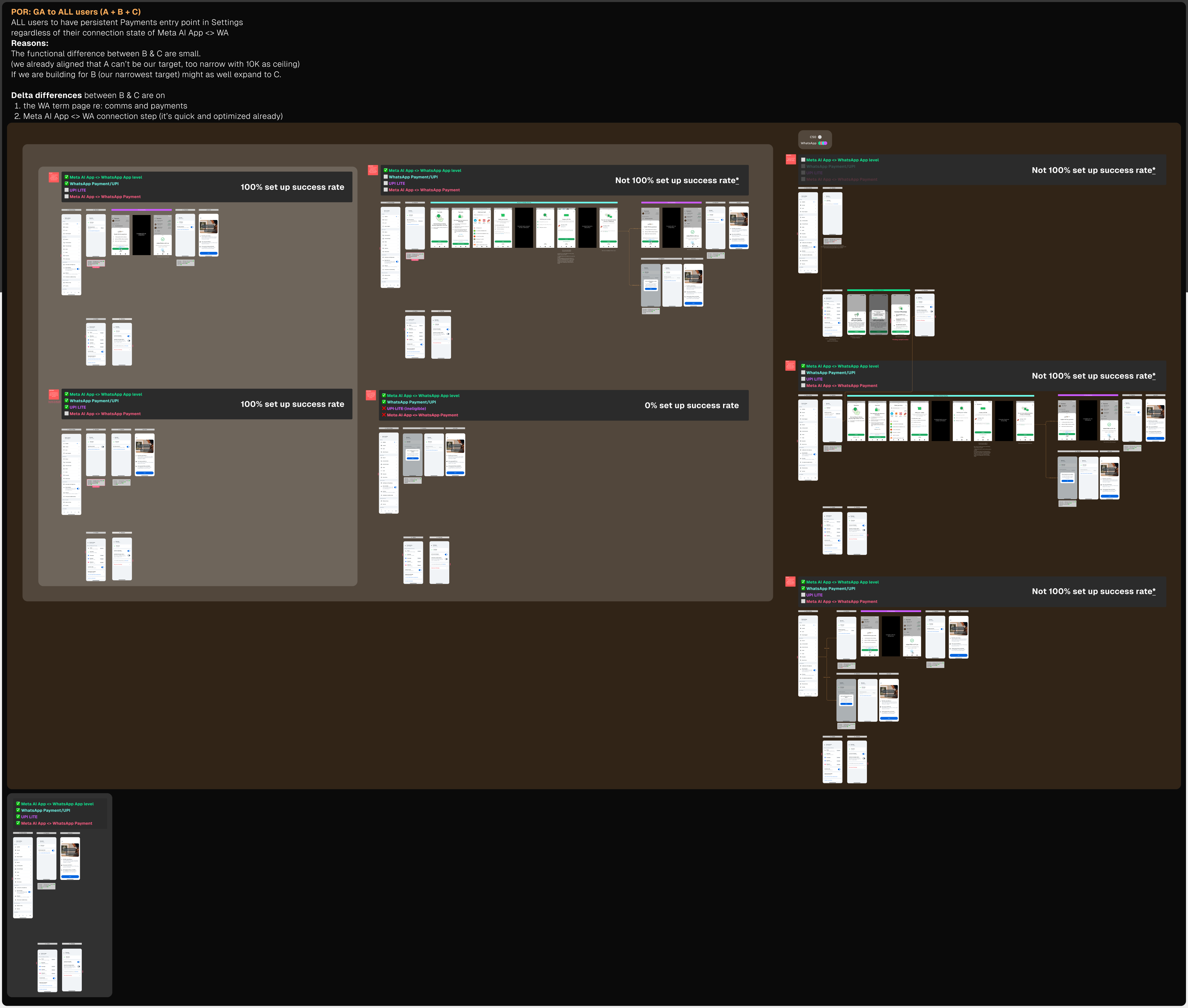
Who should we target if not everyone is eligible?
I aligned PM, tech lead, and product marketing with my recommendation.
Education inside the flow,
not beside it.
User education and settings had always been two separate flows. I worked with the user education team to fold education into setup itself. This is the first feature to adopt it — if the pilot holds, it becomes the pattern for every feature after.
Demoed live in Mumbai. First on glasses.
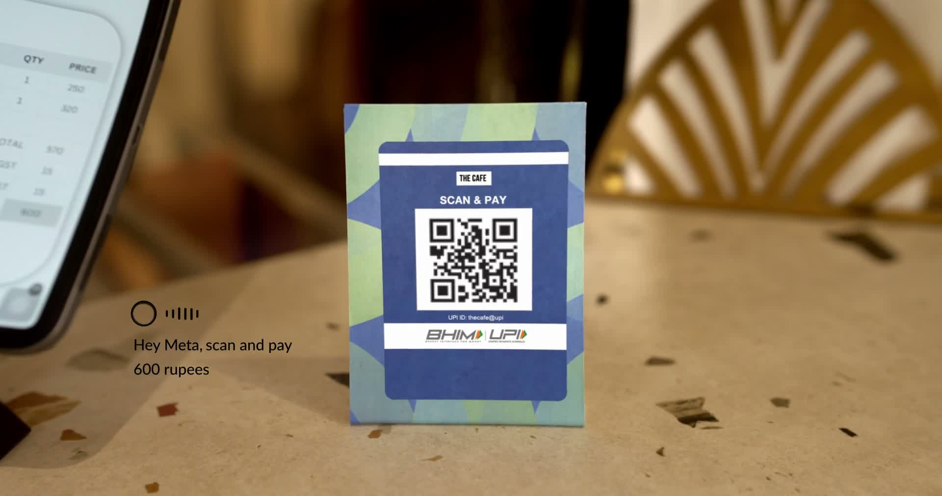
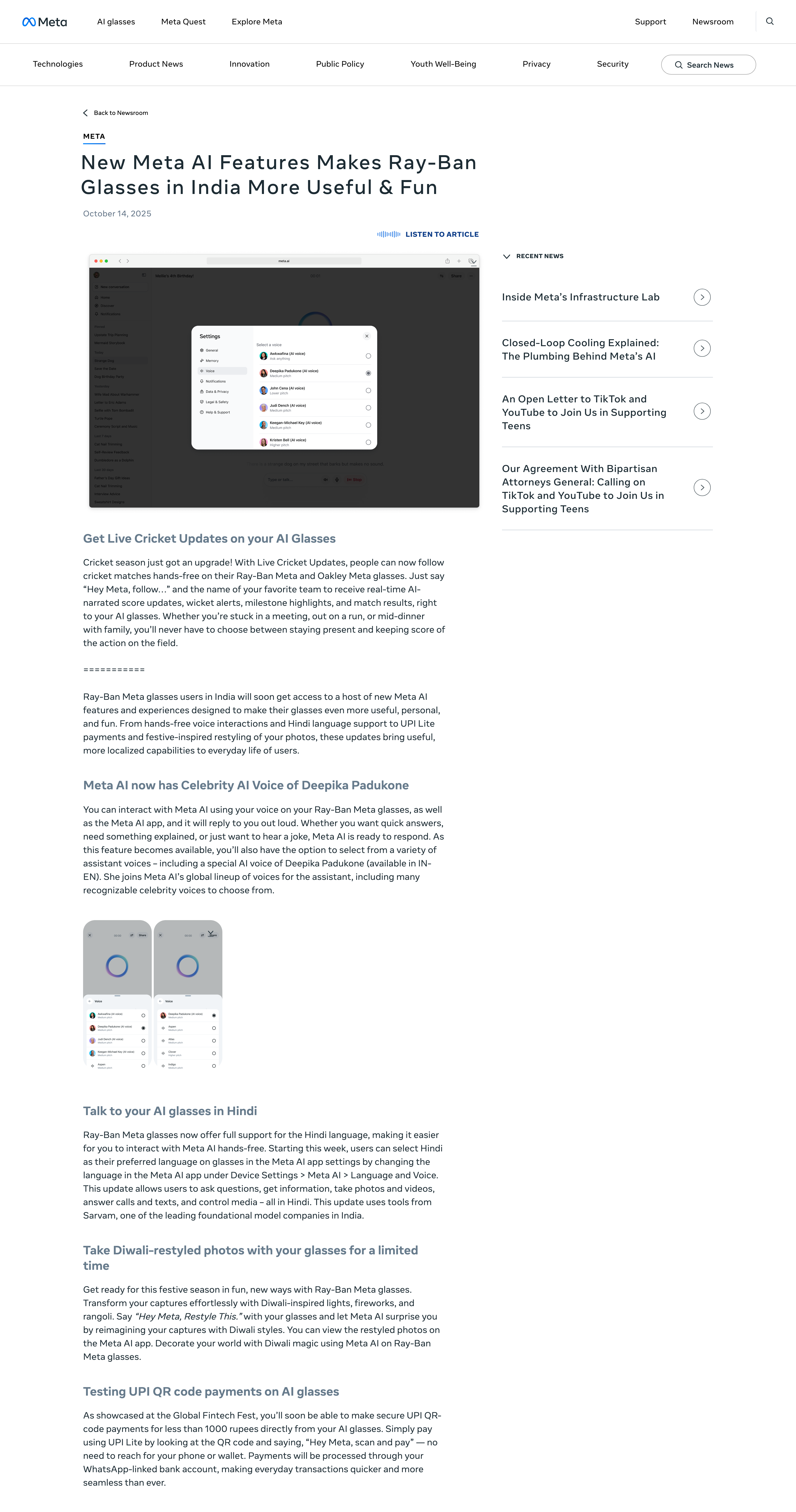
Announced with a live on-stage demo at the Global Fintech Fest 2025 in Mumbai: the first QR payment completed on a pair of glasses. Full rollout is gated on regulatory approval. Payments earned a place on the Wearables H1'26 roadmap, and the pilot laid the groundwork for a US rollout.
Break the ceiling with new bio-auth,
and onto AR glasses
The cap makes the pilot possible, but also limits it. Above it you need real authentication, and on a phone that means a PIN, which means taking the phone out. Hands-free ends where the cap does.
I led bio-authentication integration with payments and on next-generation display glasses. Two things get better: bio-auth proves who you are, so the amount stops being bounded. And the screen allows discretion for sensitive interaction such as tipping.
The complexity was mine to absorb.
An alignment tool, not a demo
My prototype was not the traditional click-through, it highlights how the complex system works for 6 launch scenarios. That’s what got 5 teams aligned and the leads’ buy-ins.
Clear isn’t the same as simple
Showing the complexity isn’t removing it. My V1 explained setup in steps, but you couldn’t tell where you were. So I grayed out the states ahead — now progress was obvious, and that was the problem. The fix was removing the need to explain.
Speed was the goal; scalability was what I kept in view
Settings was overhauling the IA for connected apps, it was like driving a rocket that was still being built. I shipped the nested entry for the pilot and tracked their roadmap, so we could trade up later instead of undo.